-
Posts
3,943 -
Joined
-
Last visited
-
Days Won
107
Content Type
Forums
Gallery
Store
Everything posted by milandro
-

I can’t seem to be able to edit a post where I put pictures?
milandro replied to milandro's topic in Fuji X Rumors & News
I have been told that this is depending on editing limits (which once we din’t have). I think that we should be able to edit and remove AT THE VERY LEAST our attachments and that this function (once it was available) should not be linked to the text editing , which , for reasons that I don’t really understand has been limited to first 120minutes and now is a week. -
-
-
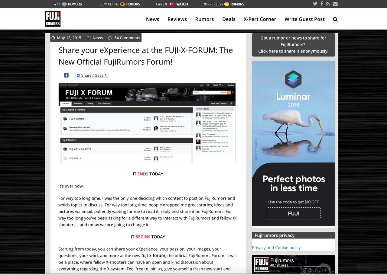
I don’t know if and when you are coming back to this, but the forum still looks as butt-ugly as it did when it re-appeard in its new unflattering version. I hope that you are going to follow up on the promise of improvements. Using this interface feels positively uncomfortable. It is not impossible to use, of course. I’ve posted quite a bit since the “ new look” came to pass, but it really bothers my sense of beauty to use a mostly white page in this day and age and more importantly for folks ( photographers) whom value aesthetics (don’t we?).
-
-
-
-
-
as far as I know my Imac is made, very well, in China .
-
-
-
In this case I sampled the parts that I knew wold have to be close to pure white and let the program apply a correction .
-
have you taken this before changing the color temperature settings? It still looks pretty blue to me.
-
I am afraid that the baby was thrown out with the bathwater. The forum update was not only an aesthetic change but a complete migration to a different software which, very possibly, doesn’t offer that stylish look at all! Whatever it will be, the tweaks that can be brought about will leave lots to be desired in comparison to the much sleeker look the forum had before. Not only but now there is a positive discrepancy between forum and Fujirumors site/blog
-
-

Setting depth of sharp focus
milandro replied to mmathieson's topic in Fuji X-Pro 1 / Fuji X-Pro 2 / Fuji X-Pro 3
even if the camera can do the calculation for you it cannot overcome the optical laws which govern this. The (apparent) depth of field is a function of distance , aperture and circle of confusion. There will be situations in which you tell the camera that you want to focus point A close- by and point B further away but you are too close to achieve that or the aperture is to open to achieve that. Unless you are aware of how these work together you won’t understand why the camera isn’t doing what you want the camera to do (and it can’t regardless whether this is an automatic function or not precisely because of the limits imposed by the laws of physics and optics ). Anyway in your display (if you have this function activated) there is a function that shows you where the focus is in ft or m, there is also a function that shows you the interval of the depth of field ( pointing to where it is set close to you and further away from you). In not autofocus lenses this function was for example on the lens barrel itself for the operator to be aware of this. The displays, even if very sharp, can’t display the DOF is sufficient detail (unless very close by) to offer a satisfying check by vision reading. Anyway, despite any automatism you really should try to understand the principles governing DOF in photography. https://www.fujifilm.com.au/blogs/digital-photography/circle-of-confusion-and-what-it-means-to-be-in-focus -
indeed, alongside with the cheaper and more spartan look and the loss of the “ recent posts “ column (which was a great asset since it gave you a view of the latest running topics) we lost that too. In exchange we got all the emoticons (or emoji as they now call them) in the world that I seriously doubt that we ever felt the need to have. I am staring at a page which is mostly white and wonder where the stylish forum that I joined has gone. Makes me feel a void. Also I am not (yet?) aware of how to add a signature , as far as I can tell, at present, this feature is either hidden somewhere that I couldn’t find or has gone altogether.
-
-
-
cheers and thanks. On my end everything still looks pretty much the same but I trust the updates. Really I liked almost everything of the previous version including the limited choice of emoticons. Now we have lots of stuff but it looks so much more ordinary if this would look more similar to the blog part of the forum I’d be way happier
-
another thing. On the old version there was a way to see the latest threads and I always looked at that, now this seems to have disappeared (or I haven’t found it yet) and it is quite annoying to have lost this feature which I favor everywhere I participate.
-
well, besides the interface that is the typical cheap looking interface, now I am facing a page mostly white with lots of very annoying simbols and icons. The only similarity with the old look is the black header. Also, the signatures have disappeared but that is more of a detail. I really find this look cheap and not stylish while the previous was much more special. The only thing that has bee kept is the black band header above, all the rest, including more stylish lettertypes, is gone and looks terribly different and not pleasant, this is from where I sit. One of the things which attracted me of this forum was the graphic form, the new one is, sorry to say, cheap and uninteresting.
-
I have to say that I preferred the old look way more than I like this. Old look was more stylish and now this forum looks like many others. 😟


